If you’re reading this article, there’s a good probability you’ve heard the saying “content is king”. Well, I’m here to tell you that this is a lie.
Content is not King when it comes to capturing online leads for your property management company.
Now before you freak out, I suggest you read the rest of this article to find out why I’m saying this and what the most important aspect is for your property management company when it comes to online leads.
If you were planning a dinner party, before you invite anyone over you would clean your house and make it look as appealing as possible.
Online is no different.
Before you start investing in marketing, spending hours writing content, and sending traffic to your website, it’s crucial to make sure it will convert that traffic into leads.
Unfortunately, I see way too many property management companies that have a website so poorly designed that even they admit they wouldn’t hire their own company based off the look of their site.
Great design builds trust. Trust is and always will be why people buy things, online and offline.
“If people like you, they’ll listen to you, but if they trust you, they’ll do business with you.” -Zig Ziglar

In this article, I’m going to teach you exactly what principles you need to follow when designing your property management website so that it’s ready to convert visitors into leads.
Importance of Building a Well Designed Website
In a recent research study titled “Trust and Mistrust of Online Health Sites”, they set out to find out whether website design actually leads to more trust and sales in a company.
They observed women who were facing a risky health decision while searching online for advice for a month. All the women were interested in finding out more about their health issue and they all used the internet at a minimum of once per week.
The participants discussed their impressions of each website they visited. An overwhelming majority of comments were in regards to the design of the website.
In fact, 94% stated design as the factor for rejecting a specific website.
Starting to believe me when I say content isn’t king after all?
Let’s take a look at another example demonstrating the importance of web design.
In April of 2017, a client of ours (we’ll keep their name out of the discussion for privacy purposes) was looking for help generating rental property owner leads.
Before starting any type of marketing campaign we told him he would be better off investing in a new website before investing in a marketing campaign.
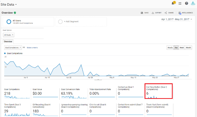
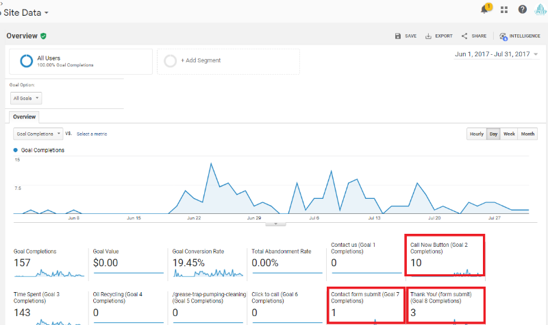
Here’s a look at the number of leads they received through their website 2 months before the redesign vs 2 months after the website redesign.
Before Website Redesign

After Website Redesign

Solely from redesigning their website, they saw a 133% increase in the number of leads (6 leads to 14 leads) that contacted them through their website.
If you’re going to convert your website’s traffic into quality leads, you need to gain their trust.
Now that you know that you understand the importance of good web design, doesn’t it seem foolish not to make some changes to your site?
To determine whether or not your property management website needs some design updates, continue reading.
There’s a number of website design principles your website should adopt. If your website hasn’t adopted all of them, it may be time to update it.
Here’s a number of website design principles that you should look to add on to your property management website.
6 Design Principles You Should Follow
1) Mobile-Friendly
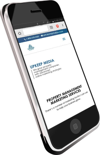
This principle should be a no-brainer but you’d be surprised by the number of property management company websites we see that aren’t responsive on mobile devices. As of 2018, mobile traffic has surpassed desktop traffic. In fact, 63% of all website visitors are using a mobile phone.
If your website isn’t mobile responsive, you absolutely need to fix this as soon as possible. Otherwise, you’re missing out on a more than half your potential website traffic.

2) Social Proof
When you display case studies and testimonials from your happiest customers (tenants and owners), you’ll find that the quantity and quality of leads from your website will increase. You can easily achieve this by displaying reviews from Yelp, Google, or Facebook on your website.
Displaying reviews from people who have already used your company’s services will help your website’s visitors relate to those people. Remember, 88% of people trust reviews as much as personal recommendations.

Pro tip: If you can get an image of your clients’ face to go along with the reviews, even better.
3) Use Colors In Strategic Locations
When it comes to color, less is more. The fewer colors you use, the more you’ll be able to make specific sections stand out by using color.
When it comes to web design, white space is HIGHLY underrated. In a world of information overload, you want to be able to guide your website visitors to specific areas on your site through the use of color.
You should be using color only in specific sections where you want your users to take action. For instance, where you offer a Free Rental Analysis or a Free Ebook for Real Estate Investors. This will drastically help increase your conversion rate.
4) Make Contact Forms Simple
Did you know that when it comes to your website, the average human attention span is shorter than a goldfish’s?
Goldfish = 9 seconds
Humans = 8 seconds
Since you have such a small amount of time to capture someone’s attention online, you shouldn’t be wasting their valuable time asking for a ton of information on your website’s contact forms.
Try to keep the number of fields to 3 or 4 if possible. Whenever possible, keep your contact form fields to Name, Email, and Phone Number.
[et_bloom_inline optin_id=”optin_2″]
5) Make Your Contact Info Visible
It shouldn’t take someone more than 2 seconds to locate your company’s phone number and email address on your website. You can do a test by asking 10 friends to look at your company website. Time how long it takes them to locate your email and phone number to see if your company information is easily accessible.
If it takes them longer than two seconds, fix that ASAP. Generally, we recommend including the phone number and email address in the header of your website.
6) Include Calls To Action
Every page on your site should have ONE Call-to-action (CTA). No more, no less.
The more choices you give your website’s visitors, the less likely they are to make a decision. If you have a page on your website that asks them to join your newsletter, obtain a free rental analysis and download your e-book, they probably won’t do any of them.

The only page on your website that needs multiple CTAs is your homepage. On your homepage, you should make it clear where tenants and owners should click to access their section of your website.
Let’s Look At The Numbers
If you’re updating your property management website out of the stone ages, do yourself a favor and hire a professional. Make sure you build a website that’s going to represent your brand and build trust in your company. Give your web designer this list of principles and make sure they follow them.
While it may seem expensive to hire a professional to build your website, the opportunity cost is far greater.
To drive this point home, let’s take a look at the numbers.
If your current website has 1,000 monthly website visitors and a conversion rate of 1%, that means you’re converting 10 visitors per month to leads.
Now if you’re able to fix your website and get a professional web design company to make you a website that follows the principles discussed above, you should be able to bring your conversion rate to at least 2.35%.
At a conversion rate of 2.35%, those same 1,000 monthly visitors will generate 23 leads per month.
Without increasing your website’s traffic, you’ll now have nearly 130% more leads simply by improving your website’s design.
Using the figures above, let’s assume you’re able to close 20% of all leads your company receives via your website into new doors to manage. This would result in your company adding an additional 2 doors per month solely due to having an improved web design.
Given that the average property management contract is worth approximately $3,000, doesn’t it sound crazy not to invest in a professional website for your company?

Want Help With Your Property Management Website?
If you’d like help designing a new website or fixing up your existing website to improve conversions, don’t hesitate to reach out to us at Upkeep Media. We work exclusively with the property management industry and have a TON of experience designing property management websites that are built to convert your visitors into paying clients.


